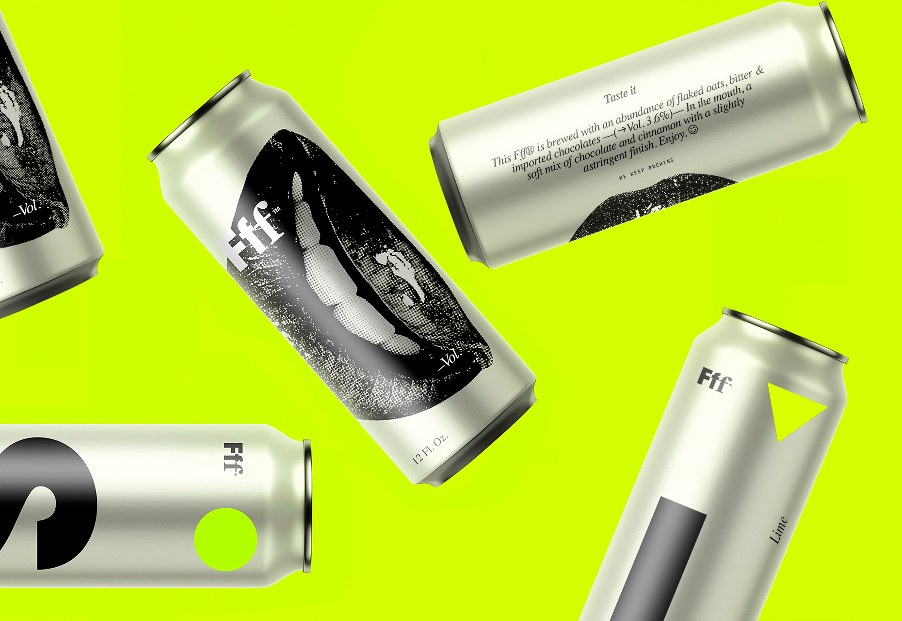
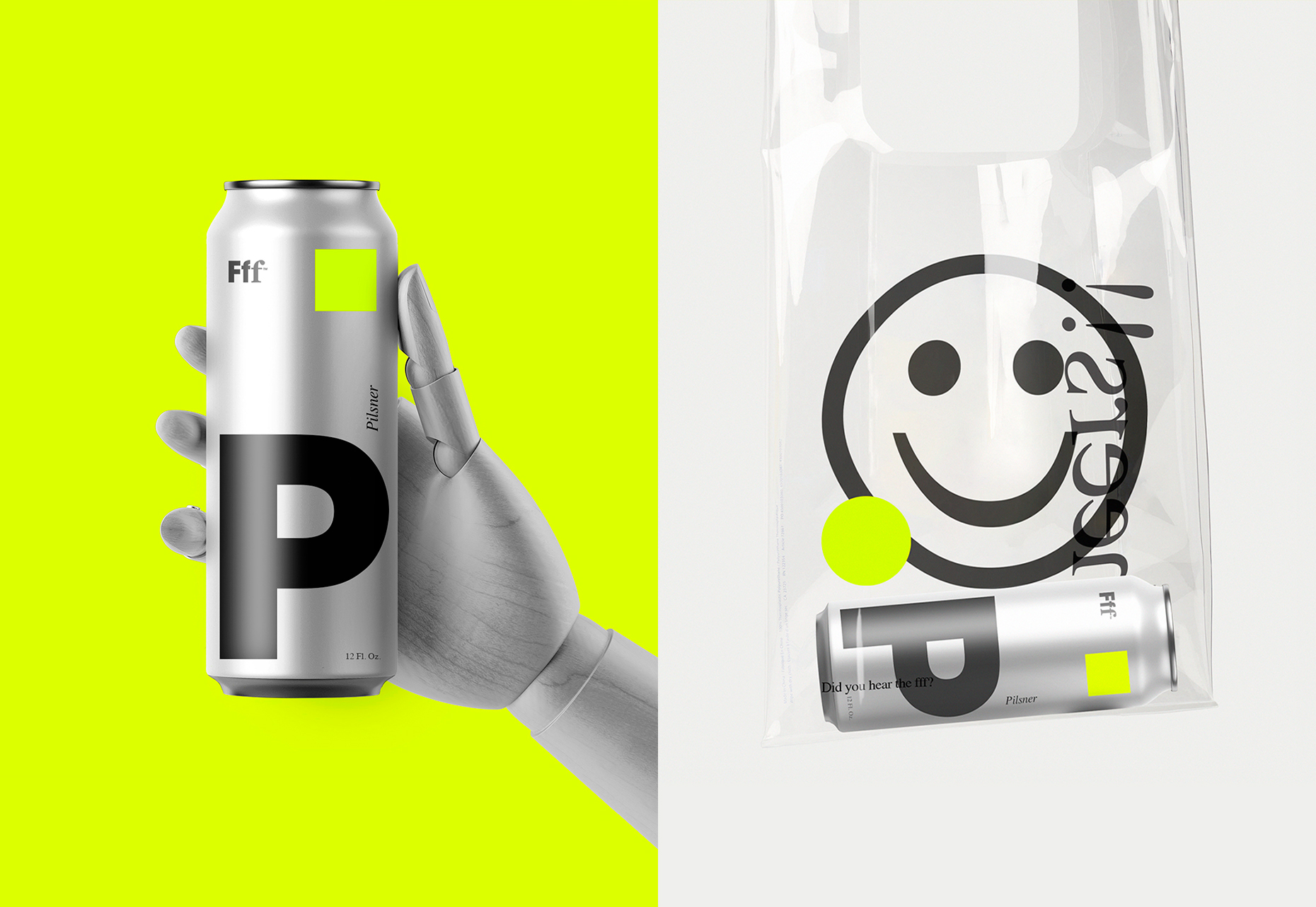
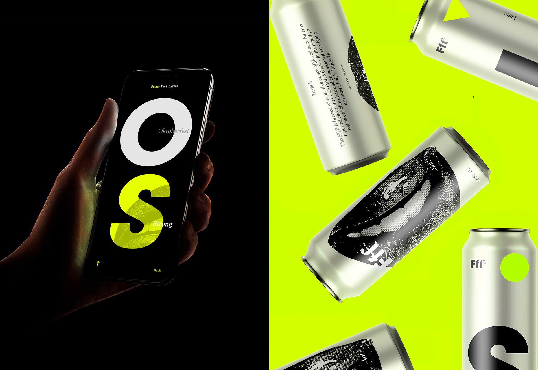
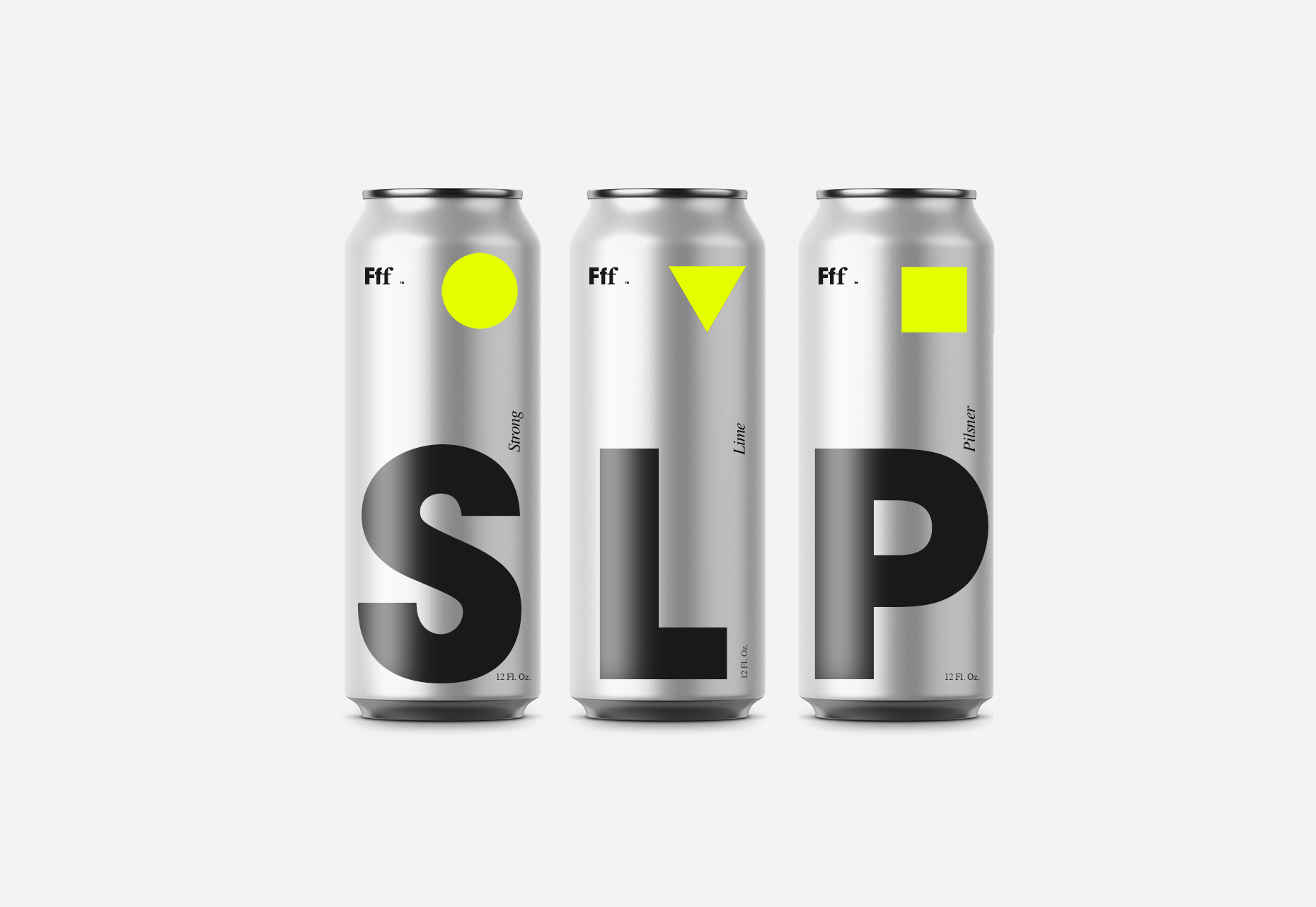
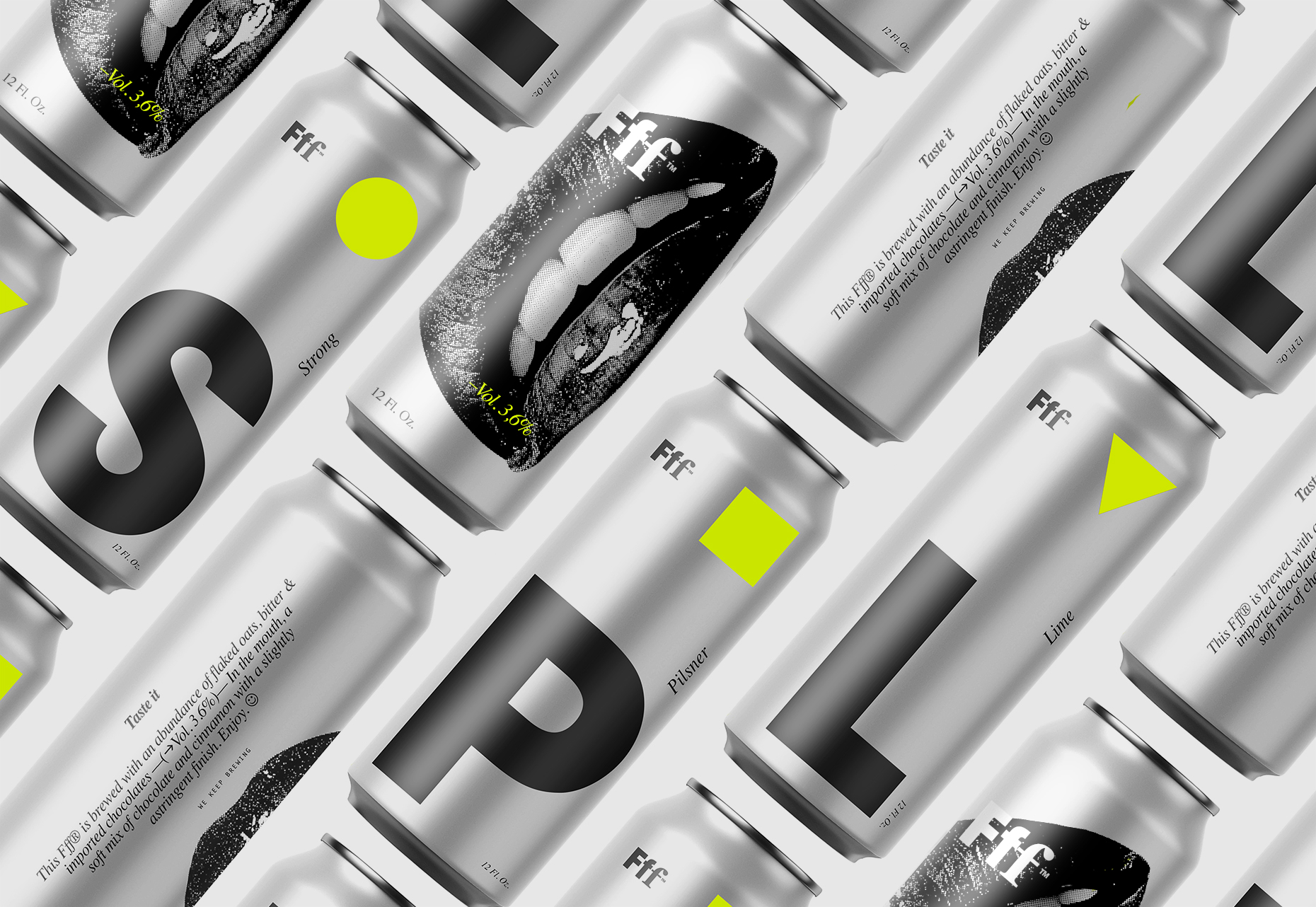
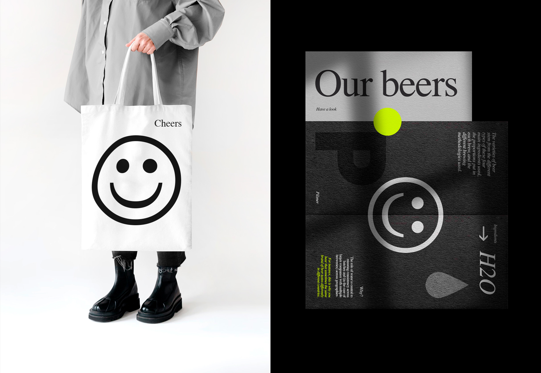
Branding and packaging design for Fff™ a San Francisco based brewing company. They asked us to create a packaging for their beer, that could stand out in the busy brewing market. The brief was quite open, except for the technical limitations of package. Based on the client's budget, we needed to be smart with how it was all put together. We had to find a way to make the can eye-catching in order to properly reflect the company's culture. The palette features a stunning yellow, bright in contrast when placed on the aluminium of the can and on printed materials.
Creative Services:
Brand Identity
Identity System Design
Packaging Design
Website Design
Client: Brewing
Year: 2020
Say hello on Instagram!