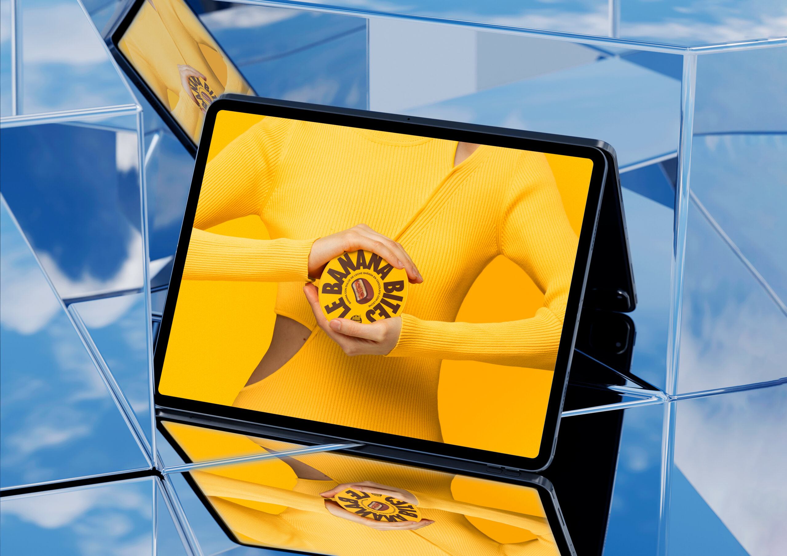
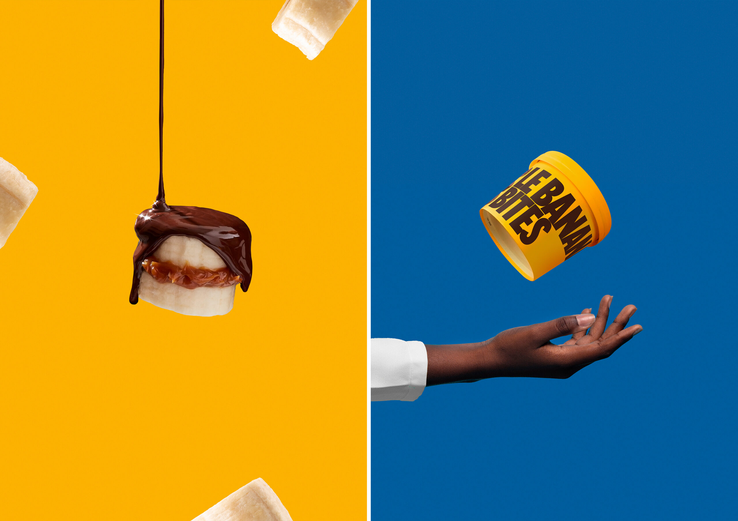
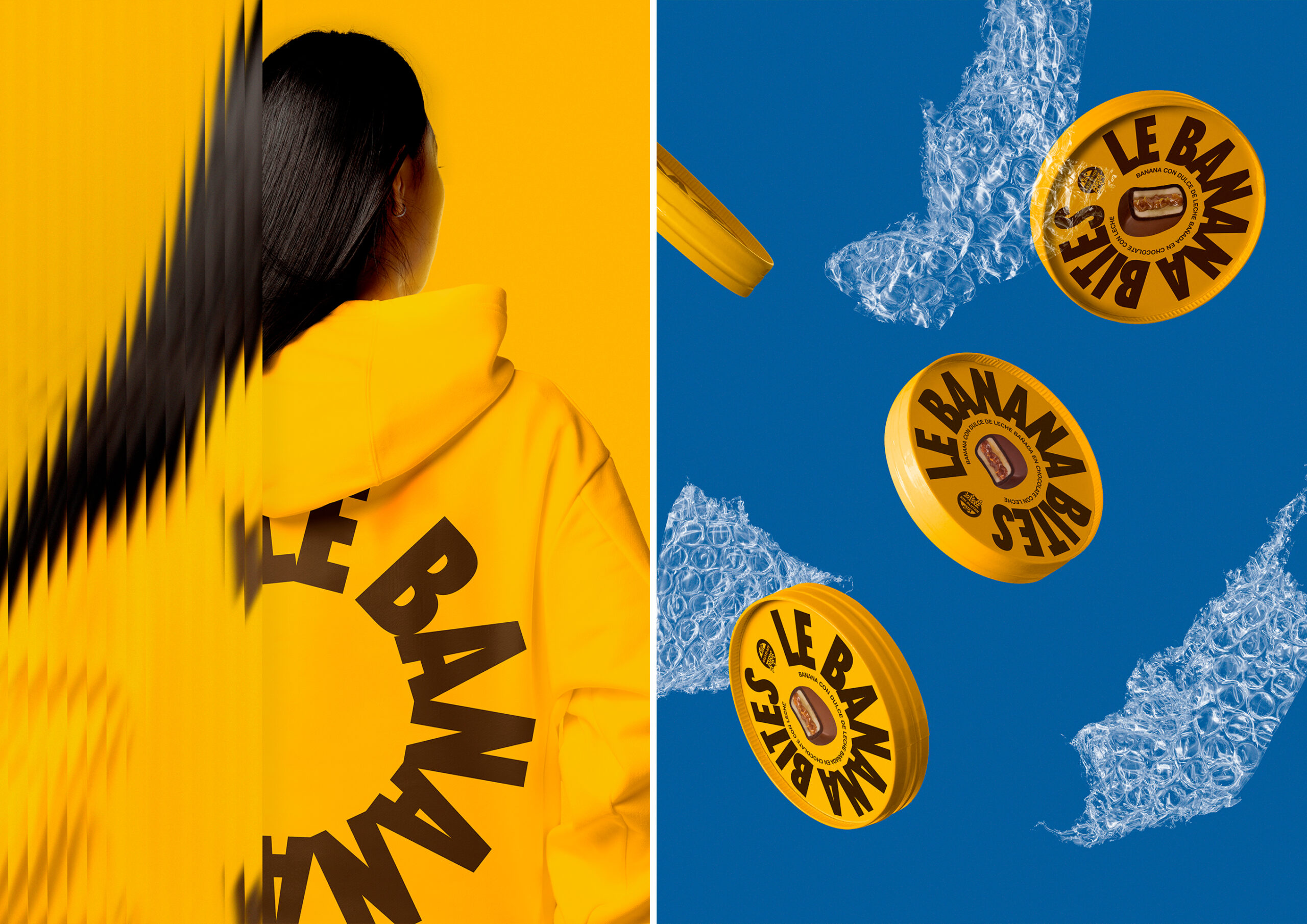
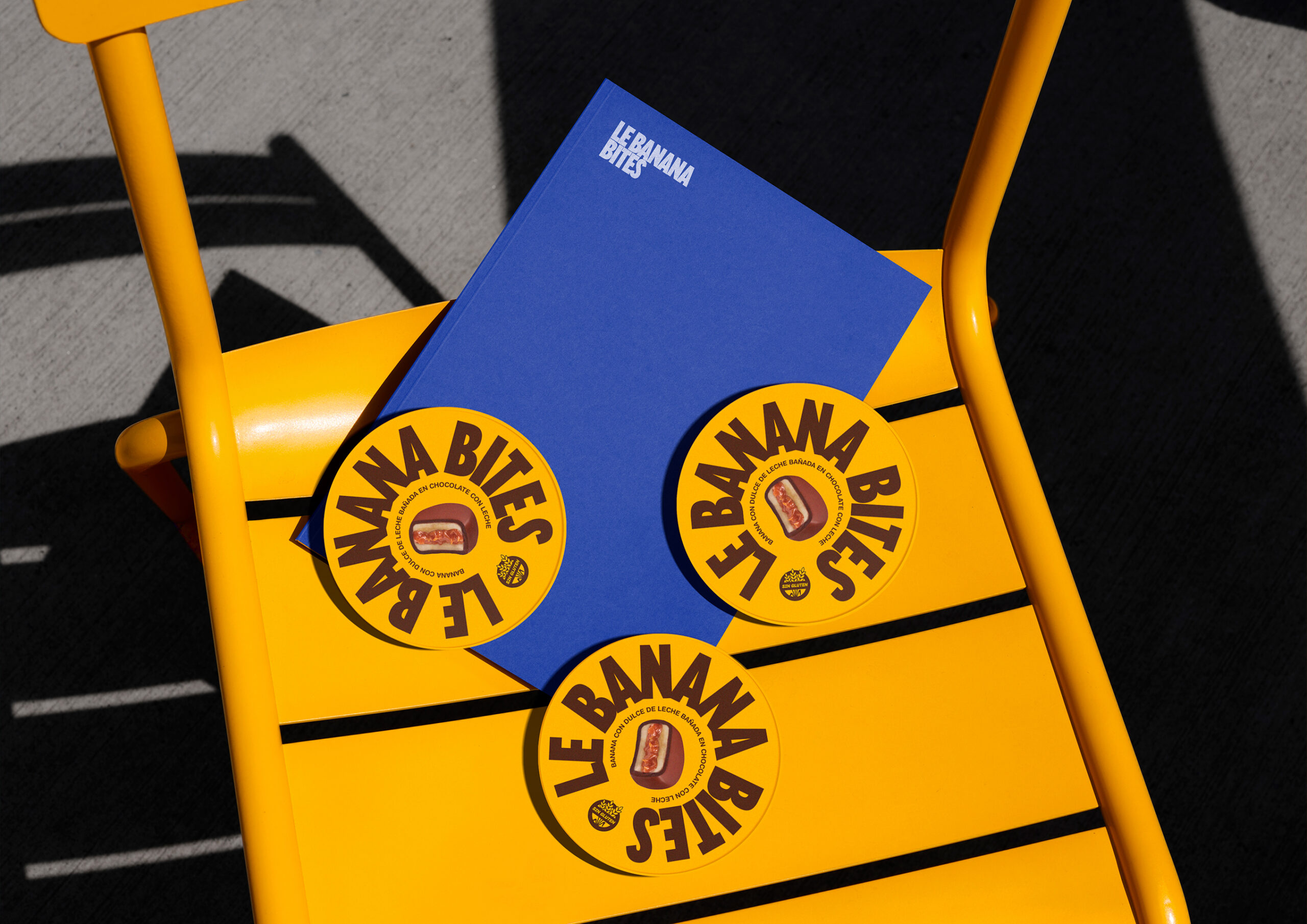
Le Banana, a brand renowned for its irresistible ice cream bites, has undergone an exciting packaging redesign. The previous design, while functional, failed to capture the vibrant strength and personality that the brand possesses in abundance. Our objective with this redesign was precisely to infuse the packaging with that unique energy and character that define Le Banana.
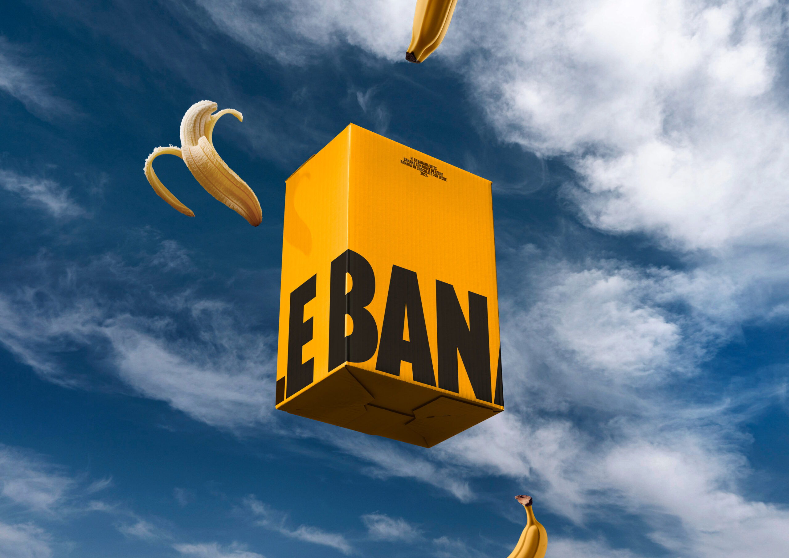
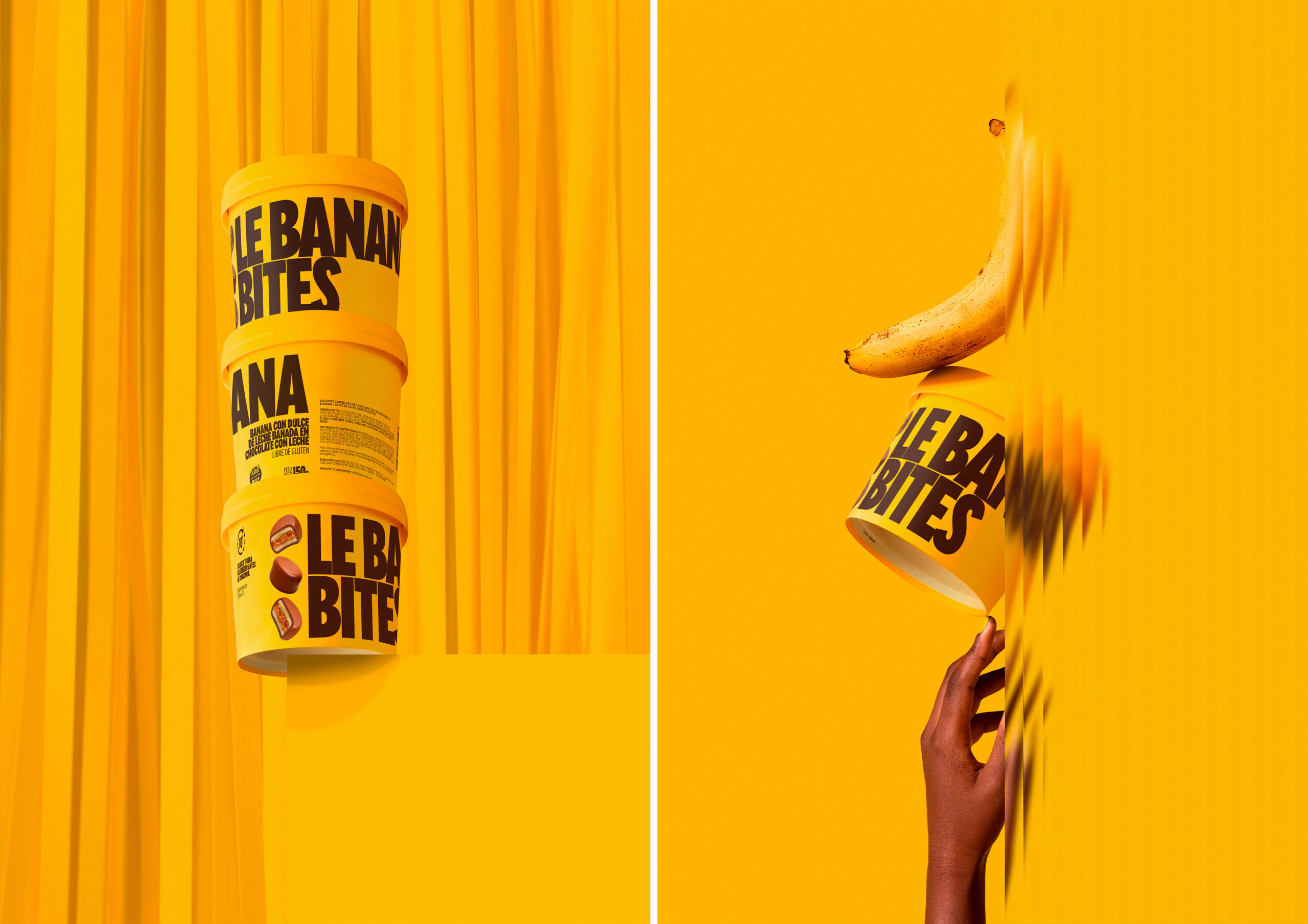
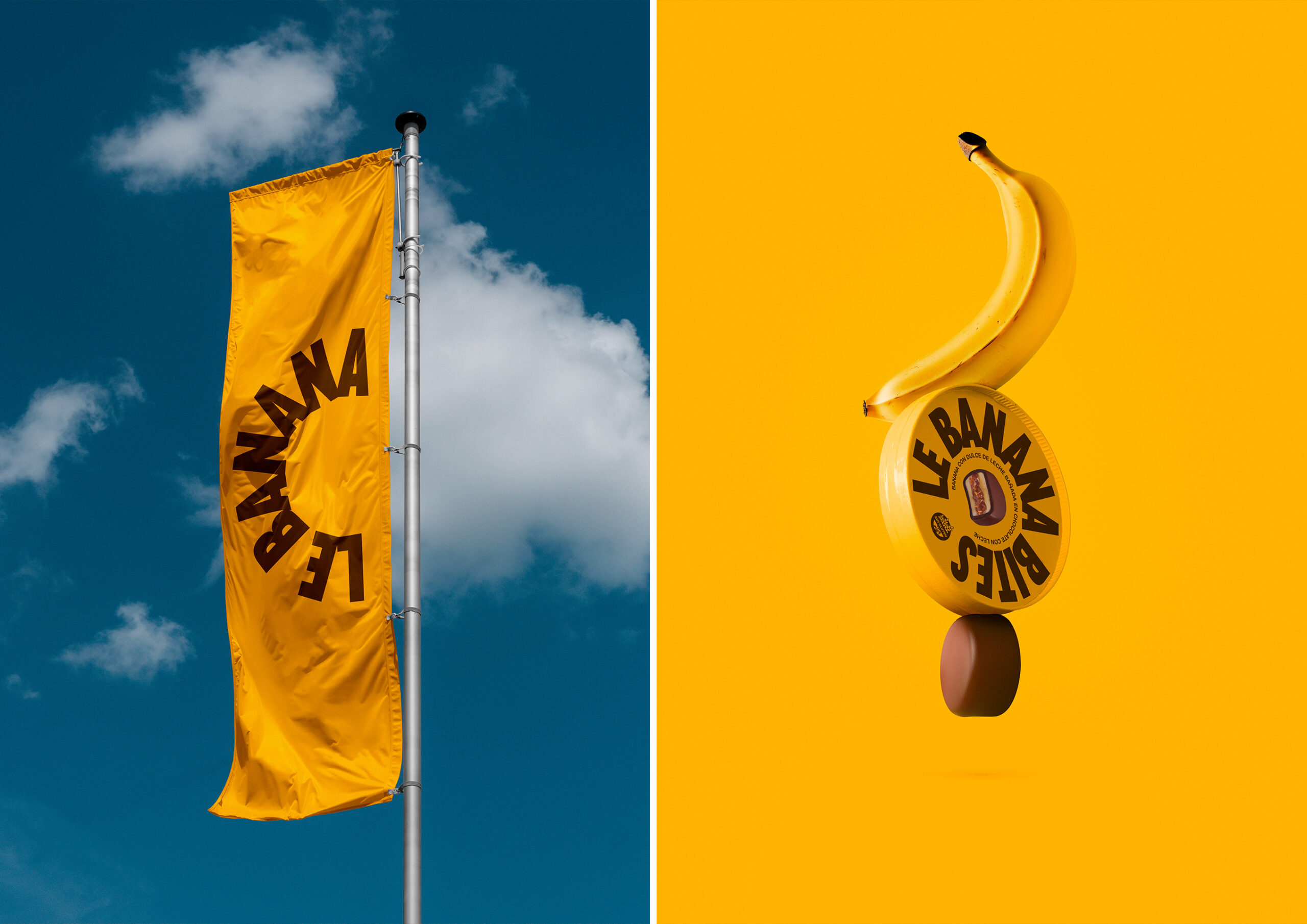
To achieve this goal, we focused on the strategic use of typography. Even though both the color of the packaging and the typography had to remain unchanged, we found in these elements the perfect foundation to work with. The challenge was significant: to transform what already existed and breathe new life into it, making it more powerful and authentic without losing the brand's original essence.
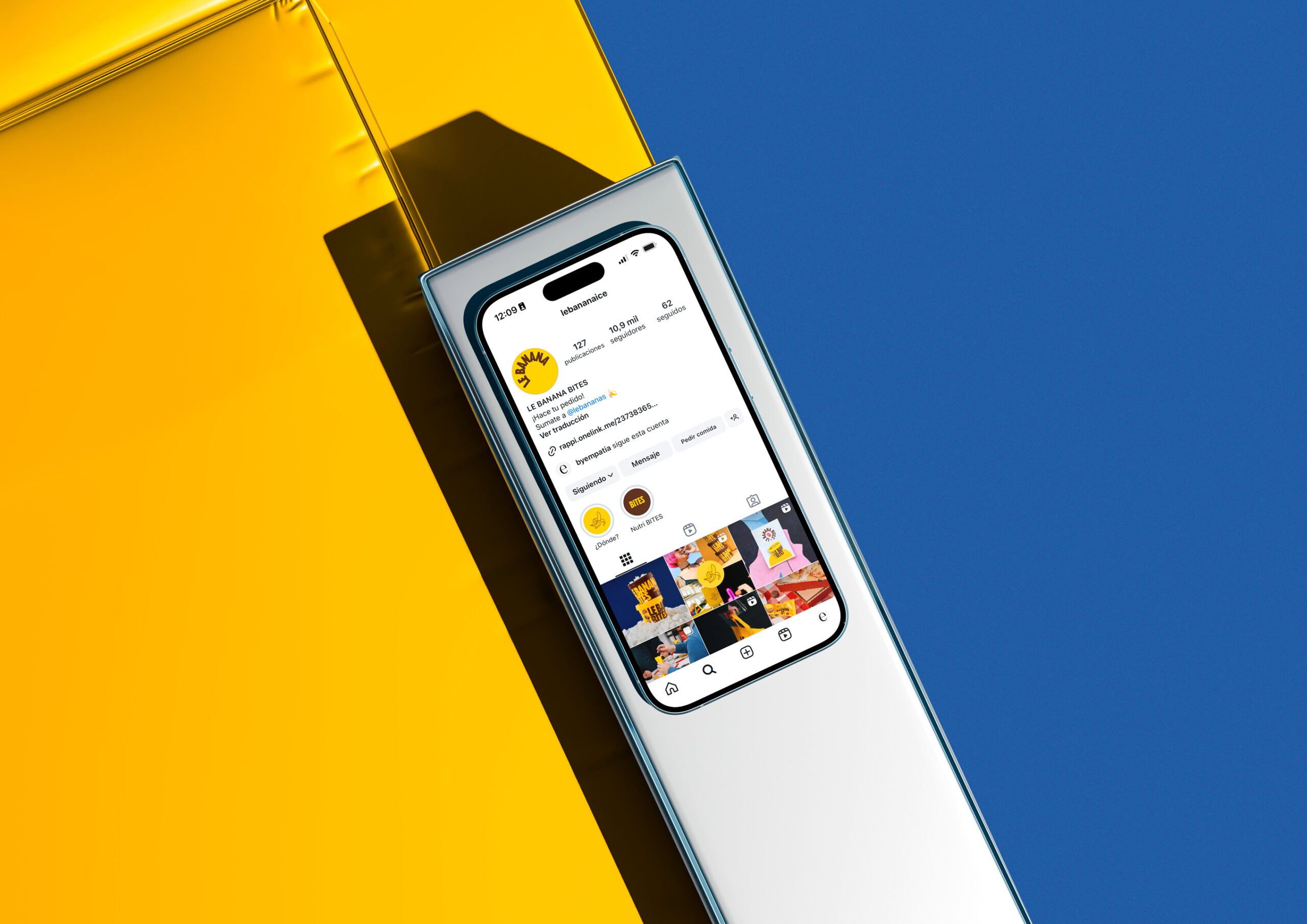
The result is packaging that is not only visually appealing but also communicates the strength and personality that make Le Banana special. Every element has been carefully reconsidered and repositioned, achieving a stronger and more dynamic visual impact. Now, Le Banana's packaging not only protects and presents the product but also tells a story, reflects the passion behind every ice cream bite, and stands out in the market with an unmistakable presence.
Creative Services:
Packaging
Client: Le Banana
Year: 2024

Say hello on Instagram!